Thanksgiving has always been my favorite holiday. It’s a time to relax, reflect, maybe run a turkey trot, and share a hearty meal with friends and family. I’m thankful for this, and so much more. I’m thankful for the work that I do as a graphic designer and especially grateful for the opportunity to work with organizations that are making a positive difference in our world. I’m thankful for the many life lessons I’ve learned through my design work, which have helped me be better at what I do, and I’d like to share a few with you.
Lesson #1: Never succumb to the “curse of knowledge.” How is it a curse to be knowledgeable? Well, it can be when you’re not able to clearly tell your story. I learned this expression from Chip Heath and Dan Heath in their book Made to Stick while working on my graduate design thesis. The Heaths say: “Once we know something, we find it hard to imagine what it was like not to know it. Our knowledge has “cursed” us. And it becomes difficult for us to share our knowledge with others, because we can’t readily re-create our listeners’ state of mind.”
Keeping this curse in mind has allowed me to design from a base of zero knowledge and explain the full story. It has helped my clients and myself remember that the audience doesn’t necessarily know what we know. I think, for example: Does an acronym need explaining? Have we clearly defined the issue? Have we given enough context/perspective?
Chip and Dan have a lot of other smart things to say about communicating your ideas. Made to Stick is a good, quick read.

Lesson #2: Don’t forget the basics, in whatever it is that you’re doing. In design, those basics include principles (hierarchy, alignment, balance, contrast, proximity, repetition, etc.) and fundamental elements of design (grids, color, white space, shape, layers, etc.). Designers follow these basics to visually convey ideas and solve problems. Use of a grid system in a layout helps organize information. Color helps create design systems. White space adds visual interest and directs the viewer’s eye.
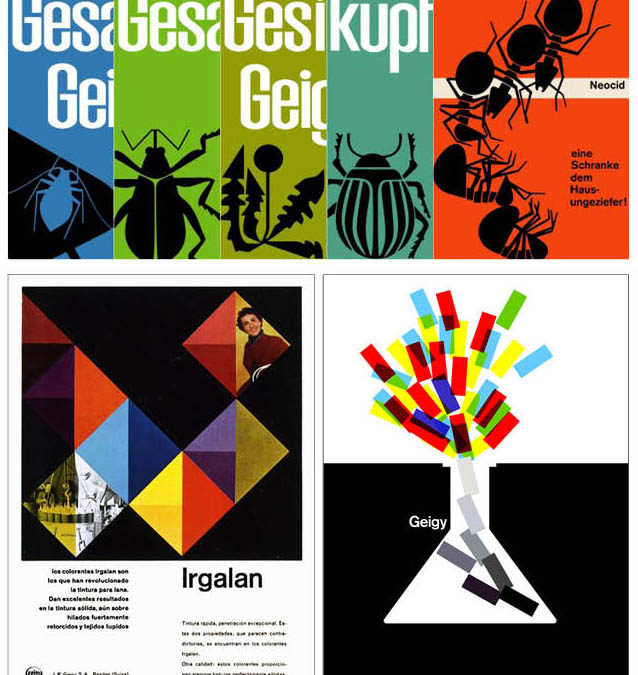
When I need a reminder of the basics, I often find myself going back in time and drawing inspiration from trailblazing work within graphic design history. An impactful example: the Swiss-style graphic design and advertising created by Geigy, the Swiss pharmaceutical and chemical company, in the 1940-70s. Geigy worked with leading designers at the time to create a visual vocabulary that was known for its white space, the use of photographs, stylized graphics or drawings, color contrasts, and grids.
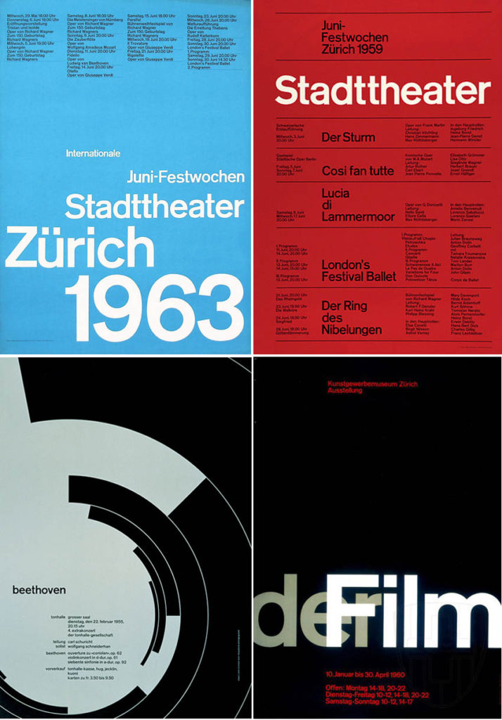
For more grid inspiration, I look to Josef Müller-Brockmann, a twentieth-century Swiss graphic designer and teacher, one of the founders of the flexible grid system and author of Grid systems in graphic design.

Lesson #3: Make people care about your issue. Design can make people care. Design can affect change; raise awareness about a cause; get someone to take action; and direct the audience to valuable resources. It’s not any design, but rather successful, content-driven design, that can get your audience to connect. The design’s visuals and data presented are the hooks that get people to care about your issue. Without that hook – visual, substantive, and emotional – it’s unlikely the design will produce the desired results.
Mona Chalabi, data editor at the Guardian, gave an interesting talk at the 2017 AIGA conference entitled “Drawing Data.” She describes her process and approach to considering the issue, the data, the design, and the audience when creating illustrations. In her direct and witty way, she shares recent successes and non-successes created for the Guardian. You can find her talk and more about Mona here.
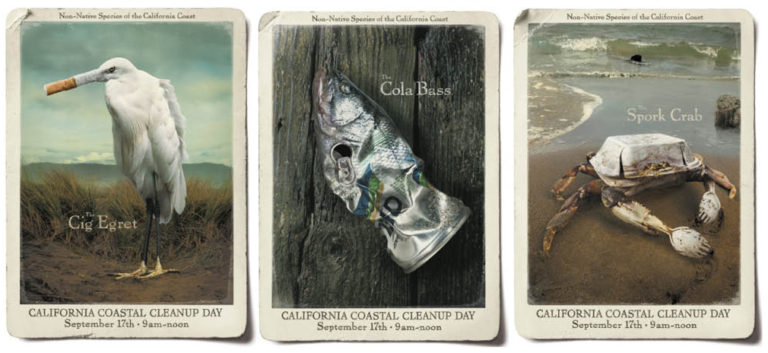
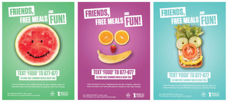
I’ll close with a couple examples of print campaigns that have made me care about the respective issues.


